Quentin Tarantino, an iconic and original film director of American movies, who doesnt know who the famed director is?
Quentin, is very specific in the font selections of his movies, and he often uses similar colors of Yellow, Orange, Red, and Black to display his font works.
Let's briefly discuss on some of his classical movies and what fonts he uses in them.
Reservoir Dogs
Is Quentin's first big picture and a success in fact, the font style he uses here is Palantino. Palatino is the name of an old-style serif typeface designed by Hermann Zapf, initially released in 1949 by the Stempel foundry and later by other companies, most notably the Mergenthaler Linotype Company.
Named after the 16th-century Italian master of calligraphy Giambattista Palatino, Palatino is based on the humanist types of the Italian Renaissance, which mirror the letters formed by a broad nib pen reflecting Zapf's expertise as a calligrapher.[4] Its capital 'Y' is in the unusual 'palm Y' style, inspired by the Greek letter upsilon, a trait found in some of the earliest versions of the letter such as that of Aldus Manutius.
Quentin used a mustard colored shade of yellow accompanied with a black shadow to create the pop in the color and great for colored backgrounds.
The Hateful Eight
The Hateful Eight is one of Quentin's Western spaghetti, using bright red (slightly orange) and yellow this particular font was created by Jay Johnson. The playful font is called Ignio Lanardi, or "Sergio Leone" and once again brings out the pop in many darker backgrounds.
Once Upon A Time In Hollywood
The movie is about a Hollywood fairytale, a vintage blend of tribute and nostalgia. The signature combo font used here is the ITC Bookman and ITC Busorama.
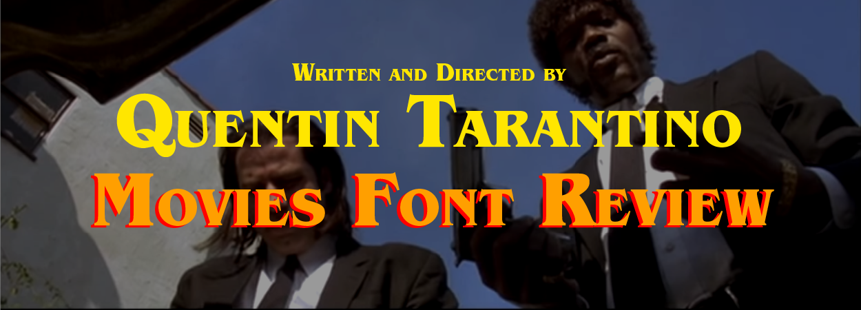
Pulp Fiction
Pulp Fiction, an American classic and a cultural phenomenon in Western movies starring John Travolta and Samuel L. Jackson. The Most iconic movie of all, and perhaps here at Galo Solutions, our favorite. The Font used in the title is Aachen Bold, the font was designed by Colin Brignall in 1969. Aachen Bold is an extra bold typeface with very narrow counters and short slab serifs. Its boldness suggests power and will correspond to solid messages where visual impact is important. As a display type, this face is recommended for use over 24 point for titles, headlines or advertisements.
The swinging 60’s was a time of great change in the world. The explosion of advertising heightened the need for typefaces that work well at large sizes. Brignall designed Aachen with this in mind, producing a design that is highly usable for poster designs, advertising headlines and other display uses.
Colin Brignall was initially a fashion designer and joined Letraset in 1964 as a photographic technician having been in the fashion trade and a press photographer. Although not hired as a type designer, he had a keen interest in artwork and typography and set about working on his second font (his first font was named Countdown, released in 1965). The original issue of Aachen was only in 5 font styles; in 1977 the font was extended to the current 15 styles. Subsequent releases have been made to offer greater language support.
----- Galo Solutions is a Technology & Creative Company located in Jakarta Indonesia. A one stop solutions for digital and design needs! Galo Solutions focus our works on website design and development (both Native and Wordpress), branding and logo creation, Search Engine Optimization (SEO), Photography and Videography, Instagram and Social Media Marketing and Management, UI/UX Design, Android and iOS Development, Content Creation, and Graphic Design. We build brands and grow businesses through creative and technological solutions suitable and customized for each of our clients and partners.